Mr Kidman's Classroom


Revise the key ideas
Visual design
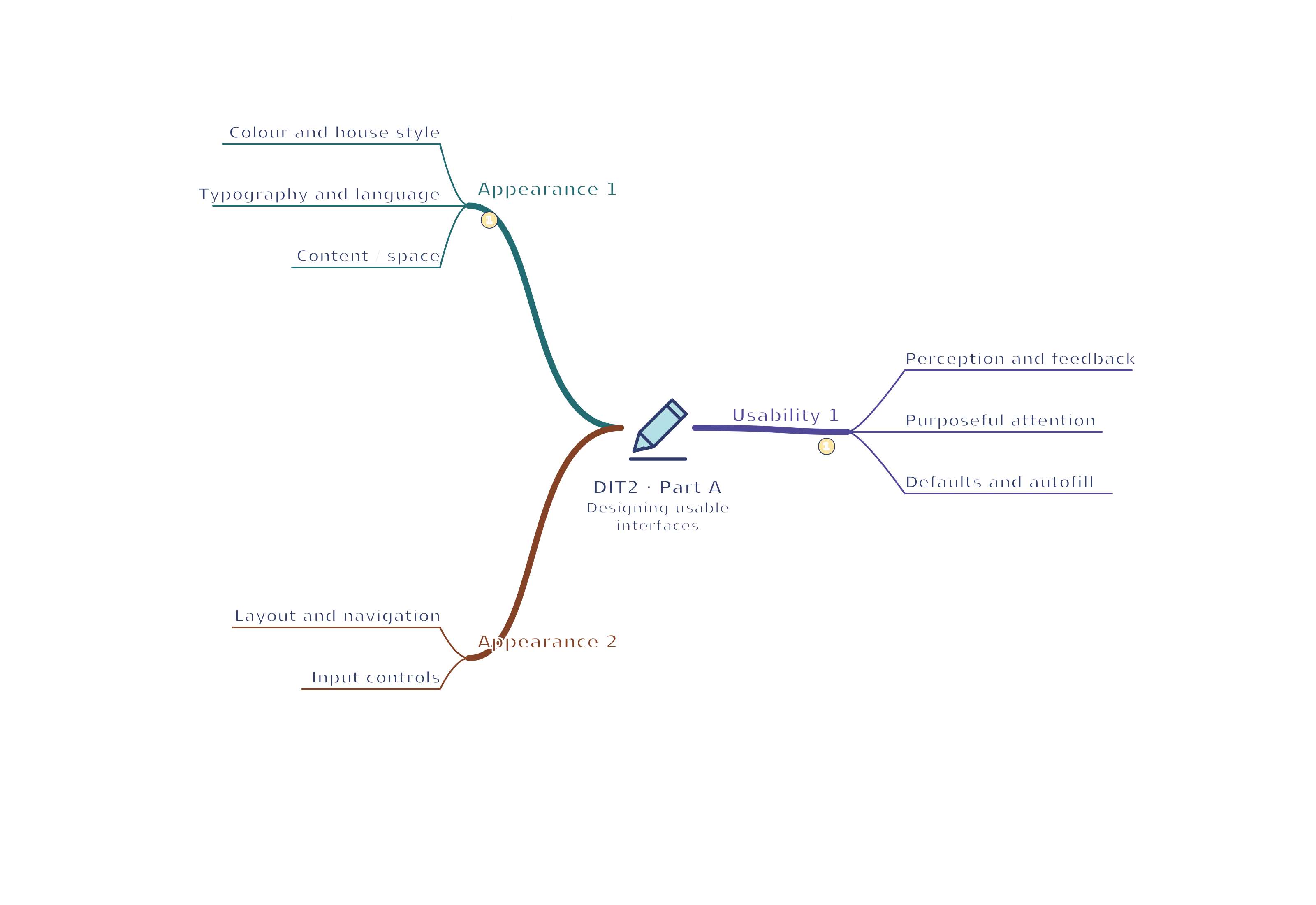
- Colour and house style — Use a limited palette with a consistent organisational house style. Check contrast and avoid clashing colours. A warm fabric-like texture may suggest an informal craft service; a restrained glossy texture may suggest a corporate service, but textures must not obscure text. Branding supports recognition only when controls remain clear.
A house style is a consistent set of visual choices, such as colours, fonts and logo placement, used across an organisation’s screens or documents.
- Typography and language — Use readable font sizes and styles, usually clear sans serif faces on screens; decorative lettering is poor for long instructions. Use language appropriate to age, purpose and expertise. Explain an unfamiliar technical term at the point of use. Increasing text size should not hide the confirmation button.
Serifs are the small finishing strokes at the ends of some letters; sans serif fonts do not have those strokes. Whichever font is chosen, test its actual readability at the required size.
- Information and white space — Present the information needed for the current decision, grouping related details and leaving space between groups. White space is deliberate separation, not wasted screen area. A booking screen should show date, activity, price and availability without competing adverts. Removing essential fees to create a cleaner screen would mislead users.
- Layout and navigation — Keep key actions and repeated navigation in consistent positions. Put important items prominently and follow familiar expectations where appropriate. Search helps find a known item; breadcrumbs show the current location in a hierarchy; icons can shorten navigation when labelled. Consistency reduces the need to relearn each screen.
A breadcrumb trail such as Home > Activities > Swimming shows the page’s place within broader sections and can provide links back to them.
- Input controls — Use a dropdown for one choice from a list, checkboxes for independent selections, radio or option buttons for one mutually exclusive choice, and a toggle for an on/off state. Label controls and make their current state visible. A checkbox saying newsletter should not secretly select a paid service.
Feedback and efficient use
- Perception and feedback — Users often associate green or a tick with success, orange with caution, and red or a cross with failure; these conventions vary. A positive high sound and a lower error sound can support feedback, but also provide text. Photographs, symbols and graphics should clarify meaning. State what happened and what the user can do next.
- Attention without overload — Messages, animation, flashing graphics and sounds can attract attention, but can distract, overwhelm or create access barriers. Use them sparingly for a specific purpose. A quiet confirmation usually needs no flashing banner. Keep the screen uncluttered and respect users who need reduced motion; attention is useful only if it helps the task.
- Defaults and autofill — A sensible default reduces repeated input, while autofill can complete an address from a postcode. Show the value and allow correction: the most common option is not correct for every user. Do not preselect unwanted paid extras. Check saved personal details before displaying them on a shared device.
- Help and intuitive actions — Use recognisable, labelled controls, short tip text, helpful pop-ups and an easy-to-find help route. Explain an error such as an unavailable session with a way to choose another. An interface is intuitive when users can predict how to act from familiar cues, not when the designer already knows it.
- Reversal and confirmation — Undo, Back and Cancel reduce the cost of mistakes and encourage confidence. Ask for confirmation before a destructive or expensive action, rather than for every harmless click. Keep a user's entered data when moving back where appropriate. A success message must not imply that an unfinished prototype has made a real booking.

A reversible booking journey. Original illustration. Open full-size diagram - Selection time — Bigger targets are easier to select precisely; placing related controls together reduces pointer travel. Distinguish buttons and links from ordinary text and make important actions easy to locate, reducing time spent searching. Avoid cramming similar actions together: a nearby Delete button can increase accidental selection.
- Shortcuts and task efficiency — Keyboard shortcuts speed repeated work for users who know them, but ordinary controls must remain available. Compare steps and completion time for a real task, including errors and recovery. Saving one click is not beneficial if users repeatedly choose the wrong session. Test keyboard order and visible focus as well as mouse interaction.
Visible focus is the outline or other marker showing which control will respond to the keyboard next. Test that you can see it as you move through the page.